Freelance information designer and visual journalism editor at Nucleo
Master in Design at EBA-UFRJ and member of LabVis
My work consists of finding ways to explain and visualize complex concepts and data through clear and
understandable charts, diagrams, maps, and illustrations.
I hold a graduate degree in Journalism from PUC-SP (Pontifical Catholic University of São Paulo) and a Masters degree in Design from UFRJ (Federal University of Rio de Janeiro), where I've conducted research on representations of the climate crisis in data visualization as a member of LabVis.
In the past, I've been responsible for dataviz and infographics at Nexo
Jornal, produced video stories at Estadão and
collaborated with dozens of outlets and institutions, such as The Intercept, Revista Piauí, Natura&Co, Loft, Climate and Land Use Alliance,
Greenpeace, WWF, and more.
I tend to prioritize projects for social impact and I'm specially interested in socioenvironmental issues and how they relate to technology.
My workflow usually consists of a combination of GIS cartography, Adobe Suite, motion graphics and R Stats — but I’m interested in finding the tools necessary for
each task and collaborating with partners with complimentary skillsets.
Currently I work part-time as a visual journalism editor at Nucleo,
an independent outlet investigating Big Tech, and take on freelance and commissioned projects — so feel free to reach out!
In this website you will find a selection of projects I've worked on with talented professionals along the way — full
credits and attributions in links (some projects are behind paywalls, unfortunately).
AWARDED
40º prêmio Direitos Humanos de Jornalismo 2023 — Second place and honorable mention for two Sumaúmastories
Livre.jor Prêmio Mosca 2023 — Winner for a Sumaúma feature on the yanomami genocide
Information Is Beautiful 2023 — Juror for the 2023 awards in the 'Current Affairs & Politics' longlist category and the 'Leisure, Games and Sport' shortlist category.
Information Is Beautiful 2023 — Longlisted for a Sumaúma feature on Belo Monte
Courses at Platô Studio — "Infografia, dataviz e infodesign: conceitos e prática" (2020, 2021, 2022) and "Gráficos interativos: conceitos, código e prática" (2023)
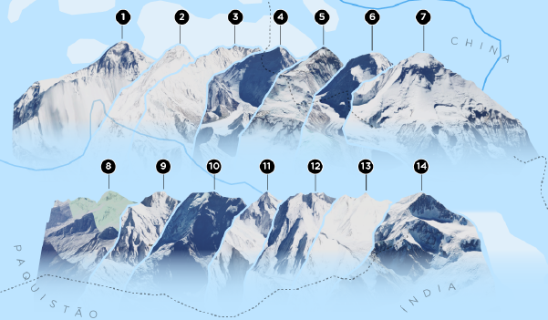
2025Several threats loom over the Cerrado, a biome considered to be the heart of South America's waters. For this longform Ambiental Media feature I got to go all out, doing art direction, maps, charts, motion graphics, illustrations and dashboards. This project was a finalist of the 2026 Sigma Awards.
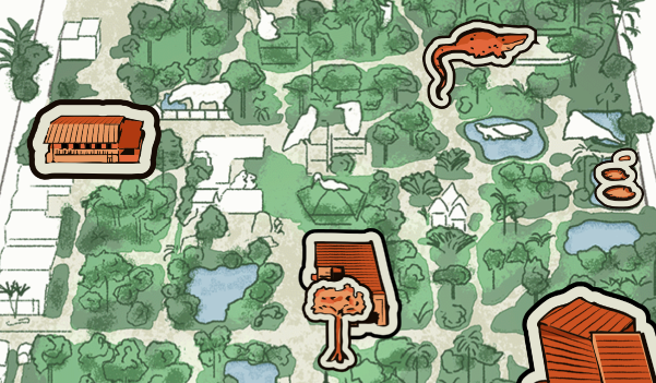
2025With a 160-year history, the Goeldi Museum, in Belém, Pará, holds the largest collection of specimens, art and wildlife on the Amazon. This illustrated and interactive map of the grounds helps support Sumaúma's reporting showing how severely underfunded and short-staffed the institution is.
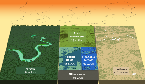
202415 million hectares of Amazon land were burned between January and October 2024. This Sumaúma report idenitifies the most common culprits and the land use categories where these fires most occurred, which I illustrated with isometric treemap charts.
2025In these interactive data stories helmed by Alberto Cairo for the European Commission, we delved into High-Value Datasets to showcase their usefulness for public policy in EU countries. Each of the five stories was paired with an educational article teaching concepts of data visualization and literacy.
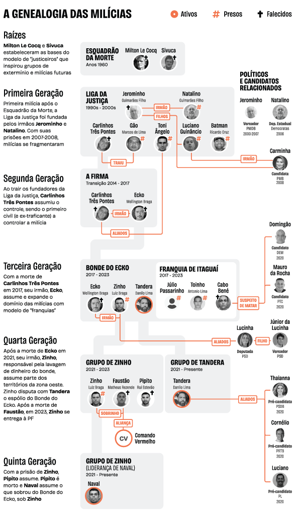
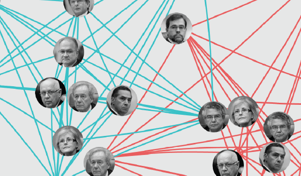
2025While investigating the network of influence, power and crime operating in Rio de Janeiro's militias for a book, journalist Cecília Olliveira supplied me with a document tracing the relations through generations of organized crime, which I designed into this genealogic tree infographic.
2025This video explainer I've animated, produced and narrated for the Intercept Brazil tries to answer the question: why do data centers consume so much energy and water? Produced in partnership with the Pullitzer Center's AI Accountability Network.
2026I was thrilled to be invited by Alberto Cairo to produce a 100% free online course at the Open Visualization Academy on how I use Figma to prototype narrative data visualizations.
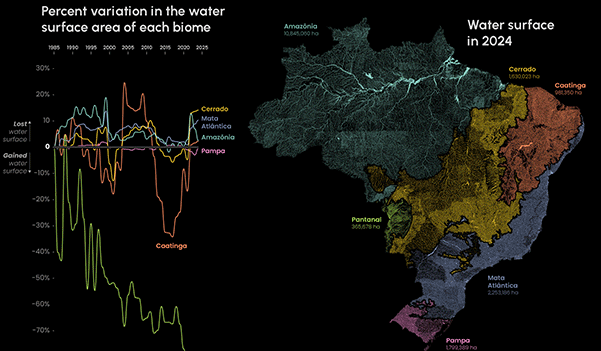
2025In this series supported by the National Geographic Society, documentarist Pablo Albarenga sets out to investigate how the global appetite is shaping natural environments in Brazil. I contributed with charts on four subjects: water surface, forest fires, soil and carbon and forest cover loss.
2024This animated videoinstallation urges viewers to reevaluate their understanding of ecological relationships. The final product of my Master's research, this project was exhibited at the Information+ Conference, in Edinburgh, Scotland.
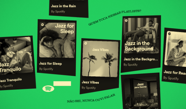
2024I was suspicious of who were the artists behind jazz tracks in Spotify's editorial playlists. Turns out they weren't real! After investigating streaming fraud on the platform, I've written this feature and edited a video on the subject.
2024I was raised on the early web before social media platforms. For Núcleo's 2024 membership program, I've written, animated, and narrated this institutional video urging for a defense of a better more open web through journalism.
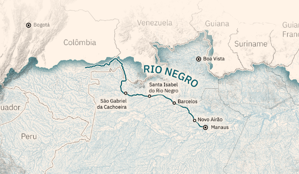
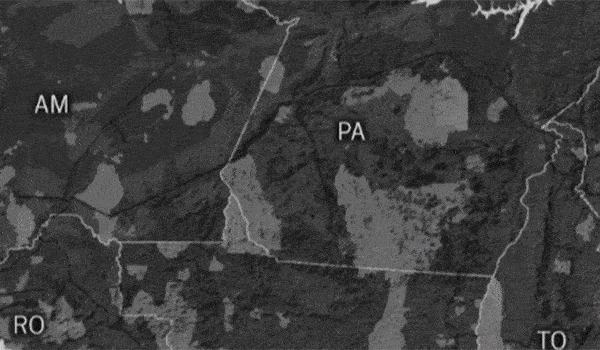
2024Ambiental Media's reporter Kevin Damasio went sailing through the Negro river with a team of scientists to assess how healthy its waters are. I did art direction, maps, and charts to help them present the results of this endeavor.
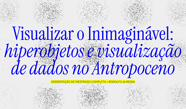
2024In this Master's dissertation (portuguese only) I investigate how the climate crisis is portrayed in data visualization projects and iteratively attempt at designing new visualizations.
2024CEOs like to brag about how sophisticated AI systems are, but much of this purported intelligence comes at the cost of low-valued labor in Global South countries. I've animated and narrated this 4-minute explainer on the issue for The Intercept Brasil in partnership with the Pullitzer Center's AI Accountability Network.
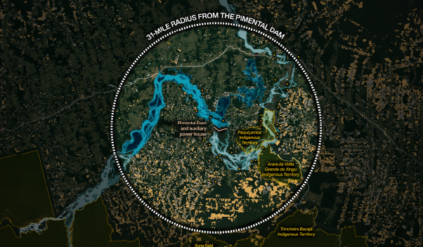
2023President Lula must decide whether to renew the operating license of Belo Monte, the biggest and most catastrophic hydroeletric plant in the Amazon. I did a bunch of maps for this feature.
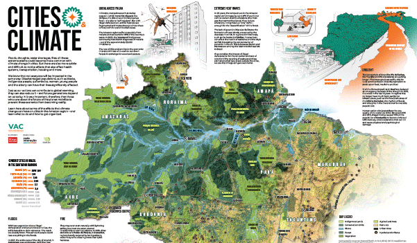
2023This large-scale infographic comissioned by the NGO Rede Interação and produced with the communities of Santarém, illustrates how urban life relates to climate change. I was responsible for research, writing, design, maps and illustrations.
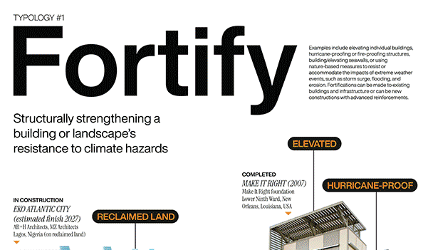
2024Series of posters designed for Alizé Carrère's doctoral research on Climatopias. Each poster showcases different (utopic/dystopic) strategies for adapting to climate change. On display at the University of Miami's School of Marine & Atmospheric Science.
2021An animated visualization and sonification that invites the reader to sync their breath with the pulses to understand how Brazil got to the sad milestone of 500 thousand deaths by Covid-19. My first use of Ableton in a dataviz context.
2022Amplia Saúde provides scientists with tools to analyze data on atmospheric pollution and maternal/neonatal health. I produced four data stories and designed their website. Funded by the Bill & Melinda Gates Foundation, CNPq and Faperj.
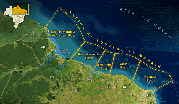
2023One of the central environmental disputes of Lula's third term, the drilling for oil in the Foz do Amazonas region sparked immense controversy. These maps I produced for Sumaúma show the extent of possible impacts on the region.
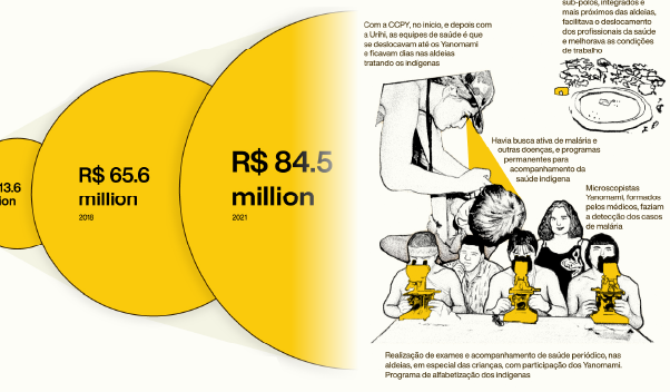
2023The story behind the couple of doctors who created the Urihi healthcare model that saved the Yanomami in the 1990s and 2000s — and were punished for it. I've produced maps, charts and illustrations for this special Sumaúma feature.
2023President Lula started his third term promising to demarcate every Indigenous land in the country. This report assesses if he will actually be able to deliver. I collaborated with charts based on the shape of traditional headresses.
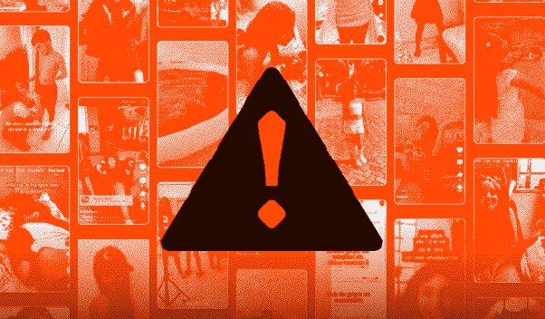
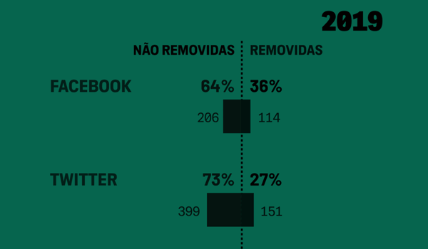
2024Kwai is a popular video-sharing app in Latin America. It is also completely infested with videos sexualizing minors. In this investigation, we ran some tests to assert how frequently the app shows disturbing content of this kind.
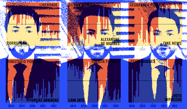
2022This visual analysis produced for Piauí with Novelo Data's team illustrates how one of Brazil's biggest TV outlets became a disseminator of Bolsonaro's ideology. For this piece I watched hundreds of programs to piece together a video montage.
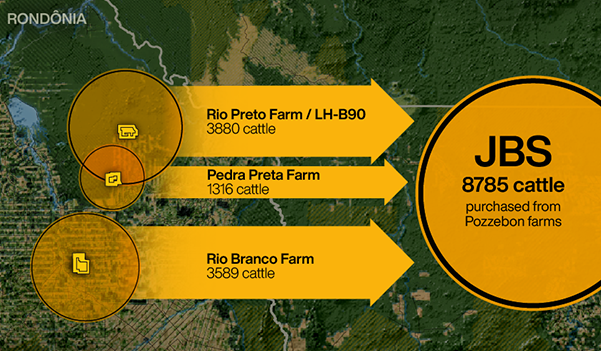
2022This collaborative investigation from Unearthed, Greenpeace and Repórter Brasil revealed how Brazil's biggest meat company bought almost 9,000 cattle from one of the biggest deforesters in the country. I collaborated with maps and charts.
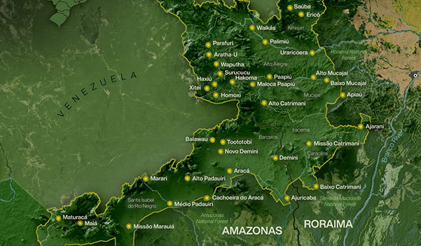
2022The Yanomami land is the largest Indigenous territory in Brazil and one of the main targets of illegal miners. Sumaúma has been investigating the situation and has published a number of reports on it. I've been collaborating with charts and animated maps.
2021Layout and visualization system developed to present Natura&Co's progress in a variety of sustainability and ethical targets, presented in a four-page factsheet and included in the company's annual reports.
2022Part of a larger investigative initiative made in collaboration with OCCRP, CCCA and Fiquem Sabendo, this piece for Piauí details how cattle laundering works and how integral it is to the meat business in Brazil. I produced charts and an animated video.
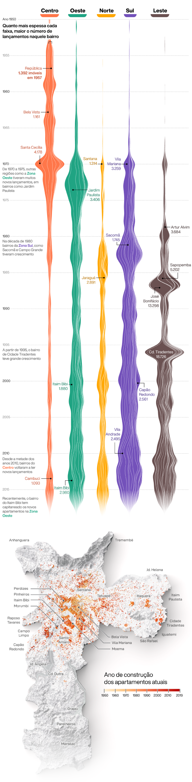
2022Over the course of 2022, I produced manyvisual stories, charts and maps for Loft, one of Brazil's largest real estate platforms using their original data on the sector.
2022Bolsonaro's disastrous firearms policy led to an explosion in the number of shooting clubs in the Amazon, correlating with an increase in violence in the region. I collaborated with The Intercept's team producing maps and charts from this data.
2020Inspired by Josh Begley, I analyzed the front page of every Folha de Sao Paulo print edition between January and June 2020 and highlighted Covid related stories.
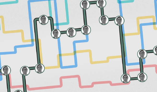
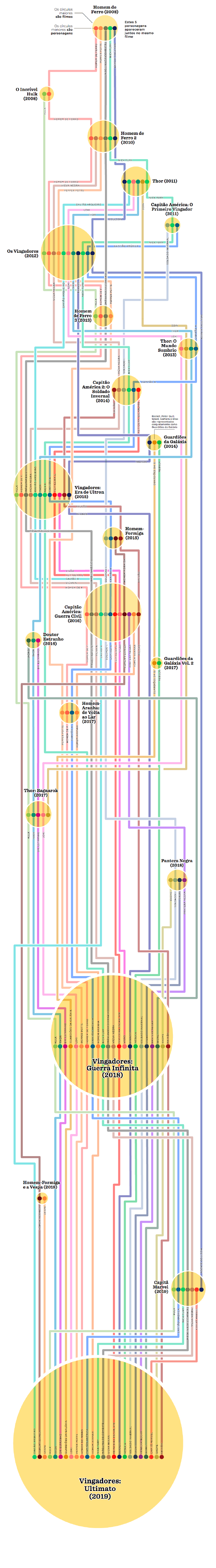
2018Brazil currently has more than 30 registered political parties. This intricate chart attempts to organize their
complex histories since 1945. This project won a bronze medal in 2018's ÑH prize.
2020In this project for Greenpeace I visualized potential threats to wildlife in recently discovered species. For
this piece I got to use Blender generated reliefs alongside QGIS geoprocessing.
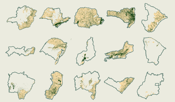
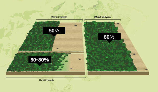
2021Piauí magazine comissioned an analysis of the status of legal reserves in rural properties in Brazil. I got to show the results with a combination of maps and illustrated charts.
2020I've illustrated dozens of stories for different vehicles I've collaborated with. For Nucleo Journalism,
especially, I developed the visual identity of the publication and its articles, combining collage with vector
illustration and noisy textures.
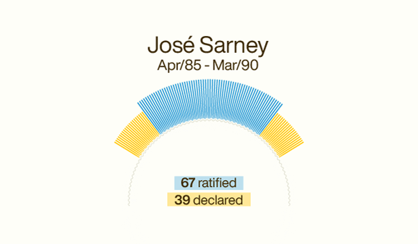
2019An analysis of the voting patterns of president Jair Bolsonaro during his 20 years in the brazilian lower
house. This project won a bronze medal in the 2019's ÑH prize and was nominated for 2020 SIGMA Awards.
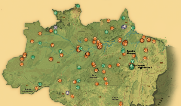
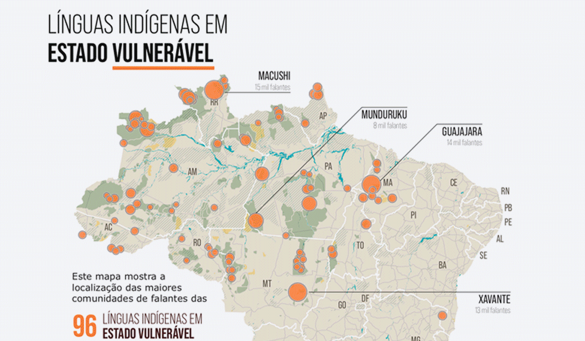
2019These maps use data from Unesco and Funai showing the state of Indigenous languages in the country. Shown at
"Línguas Ameríndias – Ontem, Hoje e Amanhã", an exhibition at Memorial da América Latina, part of Unesco's IYIL
2019.
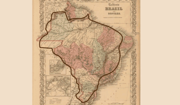
2020How does a country get shaped? In this project for Desestrutura, I overlayed historical maps to produce an animation of Brazil's outline being formed. This project was featured in Datavizbr.
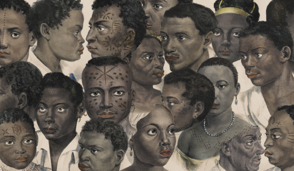
2018Charts, layout and art direction for a special feature covering the living conditions of the black population
130 years after the end of slavery in Brazil.
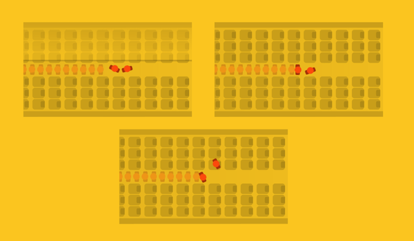
2017A 1 minute reduction on boarding time on planes can save airlines $30 to $250 dollars. This animated story
details research on the most efficient boarding methods.
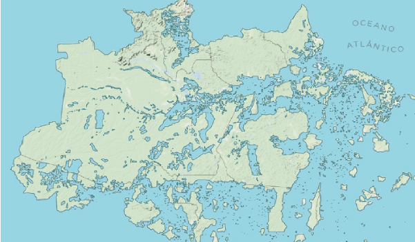
2017Who owns the land? These maps visualize how much of the country’s territory belongs to private entities, the
government, settlings, Indigenous areas and more. Inspired by NYT’s analysis of the Trump-Clinton divide.
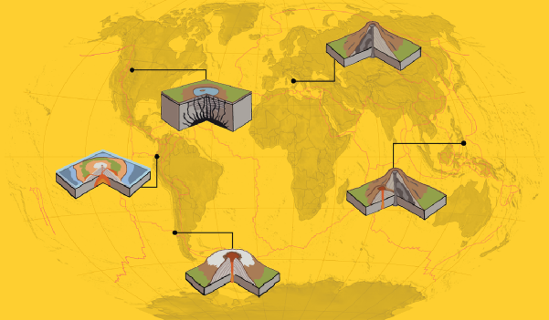
2018An animated look at Smithsonian’s Volcanism Program data on eruptions through the times — complete with maps
and illustrated explainers on volcano types.
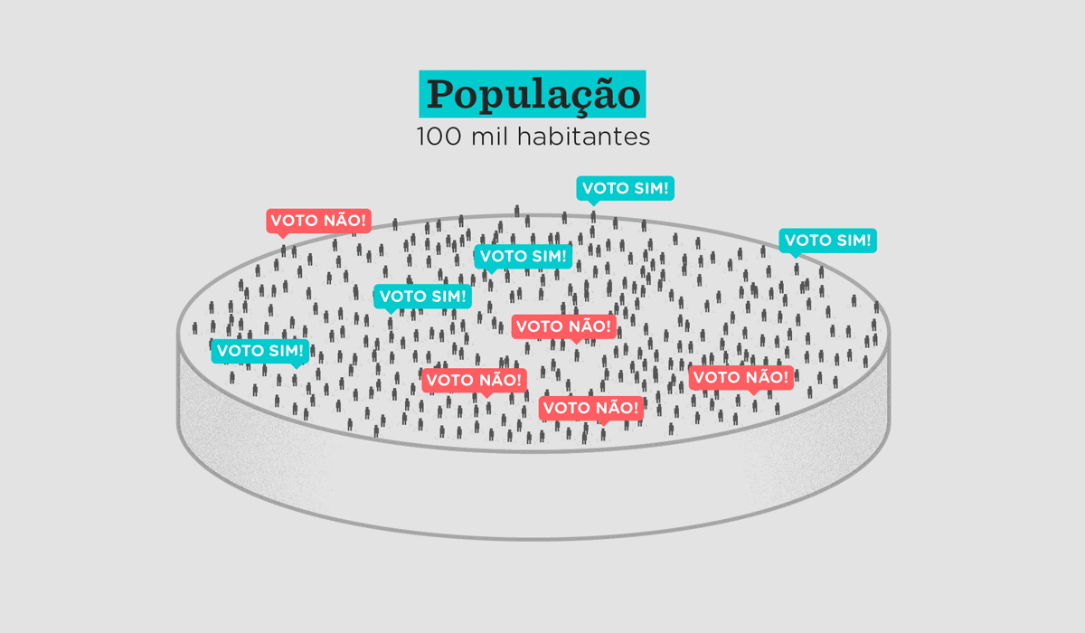
2018Script, research, voiceover and illustrations for a video explaining how political surveying works in the wake
of Brazil’s dramatic (and traumatic) 2018 national election.
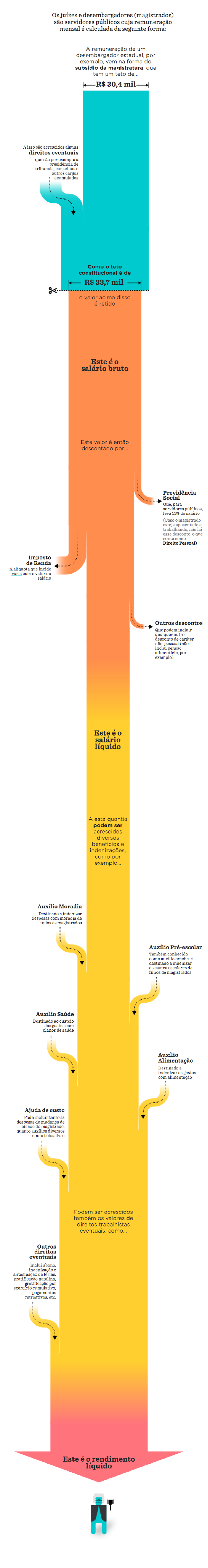
2017How can brazilian judges earn more than their wage ceiling? This analysis details how their earnings are
constructed and visualizes the judiciary’s data on the issue.
2017The 1872 brazilian census was unique for a number of reasons. Most notably for being the only piece of national
data to include slaves. This features analyzes those numbers and what their gathering reveals about slave owners
in the country.
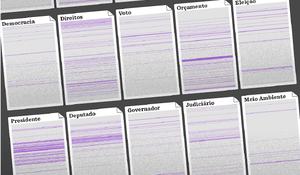
20182018 marked the 30 year anniversary of Brazil’s 1988 constitution. This series of charts analyzes how the
document has been altered since. This project won the Cláudio Abramo Journalism Awards in 2019 in the dataviz category.
2019The debate around pension reform in Brazil seems overwhelming. This video attempts to get the facts straight
through official data and animated charts.
2020Since 2013, I play bass and sing in O Nó. I've done some digital illustrations for our debut album, which were listed among Minuto Indie's “best covers of 2020”.